Menu
Close
Menu
Close
Menu
Close
Project: Embodied shopping
UX Research · Design
Project: Embodied shopping
UX Research · Design
Problem Statement: World Food Market
Grocery shopping is a routine for many families, yet stores often rely on outdated “racetrack” layouts that prioritize profits over convenience, frustrating shoppers. This highlights the need for a more customer-focused experience that aligns with their physical, spatial, and emotional needs. The goal is to enhance the shopping experience by balancing convenience with sales strategies and leveraging technology to improve in-store interactions without major product rearrangements.
Project: Embodied shopping
UX Research · Design
Problem Statement: World Food Market
Problem Statement: World Food Market
Grocery shopping is an integral part of daily life for many families, with frequent visits each week. However, grocery stores have been slow to incorporate new technologies, relying on outdated layouts that force customers to walk through the entire store to find what they need. This “racetrack” design can be profitable but often confuses and frustrates shoppers. This highlights the need for a more embodied shopping experience - one that better aligns with the physical, spatial, and emotional needs of customers. The goal is to understand what modern grocery shoppers need and create a better shopping experience that helps them feel more positive and empowered, balancing customer convenience with sales strategies and using technology to improve interactions in the store without moving products around too much.
Skills & Tools
Role
Team members
Hand Drawing
Observation/Contextual Inquiry
UX Designer
UX Researcher
Arathi Pallath
Callista Faustine
Sakshi Khilari

Solution Created
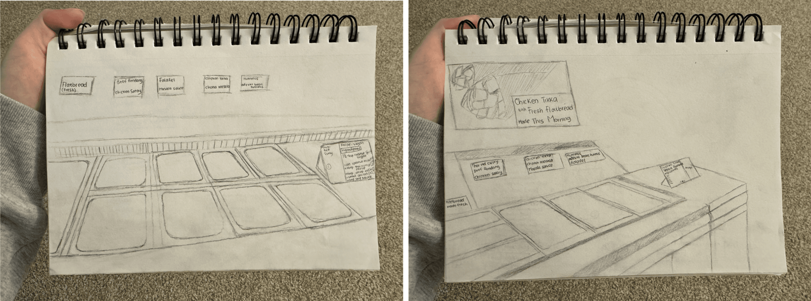
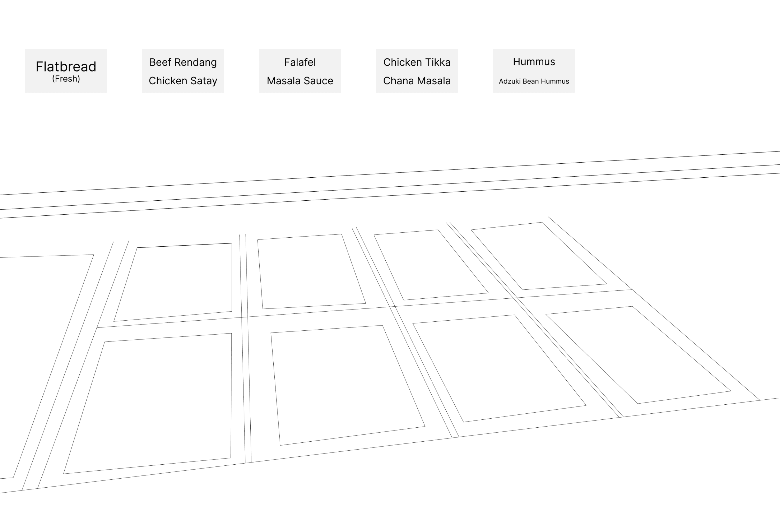
Our ready-made food counter provides customers with a selection of fresh flatbreads paired with delicious samples from around the world. This experience encouraged visitors to explore new tastes and discover the unique ingredients offered by World Food. For customers who purchase more ingredients than what they need, our recipe display can help customers see what other recipes they can make with the same ingredients.
Our Mantra
Aspiring Global Home Cooks
Research and Discovery
We began the project with a deep dive into understanding the current grocery shopping experience. Our aim was to uncover key insights regarding the challenges shoppers face, the types of shoppers that frequent stores, and the dynamics of their behaviors. Through methods like secondary research, observation and contextual inquiry, we were able to explore shopper motivations and frustrations in real-world settings. This research helped us identify target groups and potential opportunity areas for innovation, laying the groundwork for more focused, embodied design solutions.
Defining Food Explorers
In our project, we define “explorers” as individuals who are curious about trying new dishes but may feel uncertain because they haven’t tasted them before. For example, someone might be intrigued by a recipe of Kung Pao chicken but hesitates to try due to unfamiliar ingredients or cooking techniques. These shoppers often seek inspiration and information to boost their confidence, reflecting a modern approach to grocery shopping that encourages exploration and discovery while shopping.
Target Group
At this point, we were able to define a very specific type of shopper from all the research done - curiosity-driven food explorers. These are individuals who actively seek to expand their culinary horizons by cooking dishes they’ve never made before. However, they may lack familiarity with how certain ingredients taste, work together or how to use speciality products.
Usability Testing and Feedback
It was just the sketches with two people. The goal of this sketch is to assess its effectiveness in guiding users through a store to find desired ingredients. We are interested in finding out if people understand the meaning and purpose of the design, can participants locate the ingredients through the display and if the sketches make the shopping experience more enjoyable and interactive.
Both of them mentioned that the sketches remind them of a buffet, where they can just pick what they want and weigh the items at the register to pay for the meal.
The users immediately noticed the option to sample different foods and purchase ready-made meals if they don’t want to cook.
They found this feature appealing and helpful, as it allows them to explore new tastes without committing to a full meal.
They mentioned that the display is a good idea since they can take a picture of it.
They also mentioned that the pamphlet can help them visualize what the ingredients are and to include a link along somewhere in the pamphlet since they can actually remember the name of the website rather than a QR code.
Overall, it was a clear sketch that they could understand.
Grocery shopping is a routine for many families, yet stores often rely on outdated “racetrack” layouts that prioritize profits over convenience, frustrating shoppers. This highlights the need for a more customer-focused experience that aligns with their physical, spatial, and emotional needs. The goal is to enhance the shopping experience by balancing convenience with sales strategies and leveraging technology to improve in-store interactions without major product rearrangements.
Solution Created
Solution Created
Skills & Tools
Hand Drawing
Observation/Contextual Inquiry
UX Designer
UX Researcher
Role
Team members
Arathi Pallath
Callista Faustine
Sakshi Khilari

Our ready-made food counter provides customers with a selection of fresh flatbreads paired with delicious samples from around the world. This experience encouraged visitors to explore new tastes and discover the unique ingredients offered by World Food. For customers who purchase more ingredients than what they need, our recipe display can help customers see what other recipes they can make with the same ingredients.
Our ready-made food counter provides customers with a selection of fresh flatbreads paired with delicious samples from around the world. This experience encouraged visitors to explore new tastes and discover the unique ingredients offered by World Food. For customers who purchase more ingredients than what they need, our recipe display can help customers see what other recipes they can make with the same ingredients.
Our ready-made food counter provides customers with a selection of fresh flatbreads paired with delicious samples from around the world. This experience encouraged visitors to explore new tastes and discover the unique ingredients offered by World Food. For customers who purchase more ingredients than what they need, our recipe display can help customers see what other recipes they can make with the same ingredients.


Our Mantra
Aspiring Global Home Cooks
Our Mantra
Aspiring Global Home Cooks
Research and Discovery
We began the project with a deep dive into understanding the current grocery shopping experience. Our aim was to uncover key insights regarding the challenges shoppers face, the types of shoppers that frequent stores, and the dynamics of their behaviors. Through methods like secondary research, observation and contextual inquiry, we were able to explore shopper motivations and frustrations in real-world settings. This research helped us identify target groups and potential opportunity areas for innovation, laying the groundwork for more focused, embodied design solutions.
Defining Food Explorers
In our project, we define “explorers” as individuals who are curious about trying new dishes but may feel uncertain because they haven’t tasted them before. For example, someone might be intrigued by a recipe of Kung Pao chicken but hesitates to try due to unfamiliar ingredients or cooking techniques. These shoppers often seek inspiration and information to boost their confidence, reflecting a modern approach to grocery shopping that encourages exploration and discovery while shopping.
Target Group
At this point, we were able to define a very specific type of shopper from all the research done - curiosity-driven food explorers. These are individuals who actively seek to expand their culinary horizons by cooking dishes they’ve never made before. However, they may lack familiarity with how certain ingredients taste, work together or how to use speciality products.
Usability Testing and Feedback
It was just the sketches with two people. The goal of this sketch is to assess its effectiveness in guiding users through a store to find desired ingredients. We are interested in finding out if people understand the meaning and purpose of the design, can participants locate the ingredients through the display and if the sketches make the shopping experience more enjoyable and interactive.
Both of them mentioned that the sketches remind them of a buffet, where they can just pick what they want and weigh the items at the register to pay for the meal.
The users immediately noticed the option to sample different foods and purchase ready-made meals if they don’t want to cook.
They found this feature appealing and helpful, as it allows them to explore new tastes without committing to a full meal.
They mentioned that the display is a good idea since they can take a picture of it.
They also mentioned that the pamphlet can help them visualize what the ingredients are and to include a link along somewhere in the pamphlet since they can actually remember the name of the website rather than a QR code.
Overall, it was a clear sketch that they could understand.
Research and Discovery
We began the project with a deep dive into understanding the current grocery shopping experience. Our aim was to uncover key insights regarding the challenges shoppers face, the types of shoppers that frequent stores, and the dynamics of their behaviors. Through methods like secondary research, observation and contextual inquiry, we were able to explore shopper motivations and frustrations in real-world settings. This research helped us identify target groups and potential opportunity areas for innovation, laying the groundwork for more focused, embodied design solutions.
Defining Food Explorers
In our project, we define “explorers” as individuals who are curious about trying new dishes but may feel uncertain because they haven’t tasted them before. For example, someone might be intrigued by a recipe of Kung Pao chicken but hesitates to try due to unfamiliar ingredients or cooking techniques. These shoppers often seek inspiration and information to boost their confidence, reflecting a modern approach to grocery shopping that encourages exploration and discovery while shopping.
Target Group
At this point, we were able to define a very specific type of shopper from all the research done - curiosity-driven food explorers. These are individuals who actively seek to expand their culinary horizons by cooking dishes they’ve never made before. However, they may lack familiarity with how certain ingredients taste, work together or how to use speciality products.
Usability Testing and Feedback
Solution Created
It was just the sketches with two people. The goal of this sketch is to assess its effectiveness in guiding users through a store to find desired ingredients. We are interested in finding out if people understand the meaning and purpose of the design, can participants locate the ingredients through the display and if the sketches make the shopping experience more enjoyable and interactive.
Both of them mentioned that the sketches remind them of a buffet, where they can just pick what they want and weigh the items at the register to pay for the meal.
The users immediately noticed the option to sample different foods and purchase ready-made meals if they don’t want to cook.
They found this feature appealing and helpful, as it allows them to explore new tastes without committing to a full meal.
They mentioned that the display is a good idea since they can take a picture of it.
They also mentioned that the pamphlet can help them visualize what the ingredients are and to include a link along somewhere in the pamphlet since they can actually remember the name of the website rather than a QR code.
Overall, it was a clear sketch that they could understand.
Solution Created
